Logos with hidden meanings and messages, designed by OH! Design Studio along with some famous brands.
There’s a concept or story behind every logo. Logo designer has to bring that story to life through the design.
For that, the brand designer plays with different elements such as shape, line, colors, typeface, etc.
But sometimes, the best logo design elements are the ones you don’t immediately see! The legendary award-winning FedEx logo is perhaps the most common example. Other famous logos with hidden meanings include Amazon, Hyundai, Baskin Robbins, and many more.
Before we share logos designed by OH! Design Studio with subliminal messages, let’s take a look at the some of the hidden messages in famous logos.
5 Famous logos with hidden messages
Hidden meaning in FedEx logo:

Take a closer look at the FedEx logo and try to spot the arrow hidden within the white space between the letters ‘E’ and ‘X’. The arrow symbolizes FedEx’s speed and accuracy of their deliveries.
Hidden meaning in Hyundai logo:

The letter ‘H’ in Hyundai logo stands for the company name and represents two individuals shaking hands. The hidden message in this logo is represented by the handshake of trust and satisfaction between the company representative and a satisfied customer.
Hidden meaning in Amazon logo:

You may have seen the arrow in Amazon logo quite often. This arrow starts from letter ‘a’ to ‘z’, implying that they sell everything from a to z. It also represents the smile to showcase customer satisfaction.
Hidden message in Baskin Robbins logo:

OK, once you spot this hidden message, you’ll not be able to overlook it next time you see Baskin Robbins logo. Initials ‘B’ and ‘R’ are quite obvious, but these letters cleverly show number 31 representing the 31 ice cream flavors offered by this brand.
Hidden meaning in Toblerone logo:

Toblerone is a a Swiss brand. The Swiss Alps in the Toblerone logo are easy to catch, but did you see the bear? The mountain graphics includes the bear in negative space. Wondering why? Well, because brand was established in Berne, Switzerland which is known as “the city of bears”.
These are just some of the famous logos with hidden messages. There are many more brand logos which are very popular in discussions related to this subject. You got the drift?
Here are some creative examples of hidden messages within brand and product logos designed by OH! Design Studio, one of the leading branding and graphic design studios in Mumbai, India. The symbolism is obvious is some cases, but skillfully subtle in others.
#OhMade Logos With Hidden Meanings
1. FLASH ORTHODONTICS [ ADOR GROUP ]
Flash makes clear aligners for teeth alignment. The logo design represents product functionality and product benefit.
- Process of teeth alignment involves teeth movement- Design of letter ‘F depicts that forward push.
- Benefit of clear aligners is aligned teeth- The mnemonic used for letter ‘S’ represents alignment through parallelism, depicted through negative space.
2. FOCII [ ERIS LIFESCIENCES ]

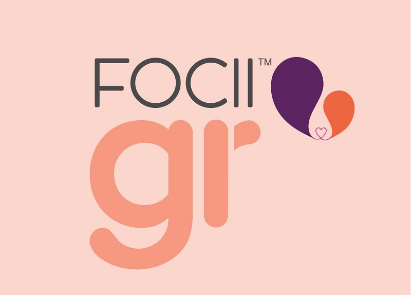
FOCII is a nutritional product for women undergoing IVF treatment. The logo design concept is mother-child linked with a heart.
The heart actually represents the life-giving umbilical cord connecting a mother and baby during pregnancy and delivering all the essential nutrients to the fetus. So, now can you see the hidden message in the brand identity design?
3. GOLFISTA

This is a wine label design named Golfista. At first glance, it looks as though this logo is simply a golf ball with dimple pattern design under the brand name.
But take a look at the creative detail of the font of Golfista. Can you see the golf club starting with letter ‘o’ cutting through letters ‘L’ and ‘F’?
4. JAYA SMRITI [ HEMA MALINI ]
‘Jaya Smriti’ is an event in memory of actor-turned politician Hema Malini’s late mother Smt. Jaya Chakravarti & is held to promote young, upcoming talent.
The folded palms in the logo are clearly visible in the first go. But the shape behind the logo means a lot more (esp. to Hema ji) than you might think at first. The logo outline represents her mother’s face. Yes, it’s personal!
5. CANVAS-M [ MAHINDRA GROUP ]

A part of the Mahindra Group of Companies, Canvas-M deals mainly with mobile value-added services (VAS).
We went with sharp curves that brought out the precision and sharpness of the solution provided by the company. The sweep of the curve represented the wide spectrum over which their products are spread ranging from entertainment, to enterprise solutions to personal platforms.
This curve cleverly doubles up as the letter ‘M’, representing the core and essence of Mahindra Group.
Looking for a brand design company? We can help.
About OH! Design Studio
OH! Design Studio is a Mumbai-based branding & design agency.
Founded in 2006, OH! Design Studio is an integrated creative and digital agency with a passion for launching, rebranding and accelerating brands. Our goal is to create lasting and meaningful relationships between our client’s brand and their audience through distinct brand experiences.
At OH!, we believe that design has the power to change behavior. We excel in designing the visual language brands need to tell their story.
For more information, please visit ohdesignstudio.com and follow OH! Design Studio on LinkedIn, Facebook, Twitter, and Instagram.

